Andy Warhol, Automobiles, and the Power of Pop

Tomato soup in a can labeled red and white. Or--if you prefer: School bus-colored hair, turquoise eye shadow, sangria-colored lips, floral lavender skin tone; it is Marilyn on a gold canvas the intensity of all colors muted. Say "Andy Warhol" and the above images probably come to mind. Say "cars and Warhol," however, and it is perhaps more difficult to marry the two. The connection is there; Montclair Art Museum has the proof on-view through June 19. “Warhol & Cars: American Icons” surveys his career work about cars, from a 1946 art school drawing up through a 1985 commemoration of what was originally an advertising series done by Volkswagen. “Twelve Cadillacs” (1962) is the launch point of the exhibit where choice of technique and commissioned work met. These two factors became both Warhol’s technique of choice and philosophical bent that would run throughout his career.
Let's take an in-depth look at three works:
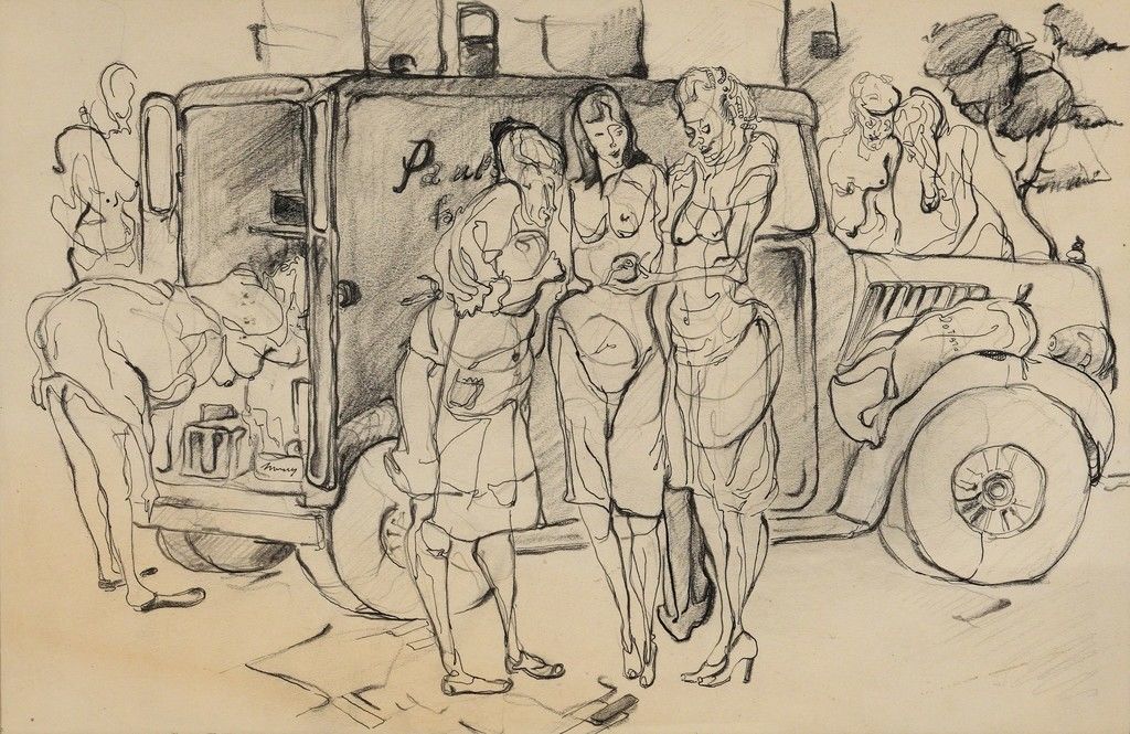
“Woman and Produce Truck” (1946) is an ink and graphite drawing on Manila paper done at the Carnegie Institute of Technology. This work was an early indicator of the drawing ability that would get Warhol work at “Glamour” as an illustrator for an article called “Success is a job in New York”just three years later in 1949.
A truck is realistically rendered. However, the form of all seven women in the drawing are either exaggerated, distorted or abstracted. For example, the three women in the center of the drawing are directly in front of the truck. Of this group, the woman on the left has cheeks that droop into a chin, the look reminiscent of a basset hound. A swish of pencil suggests a furrowed “uni-brow.” The decolletage of all the women are rendered prominently. That particular detail is not a realistic portrayal of the street scenes which inspired the drawing, from Warhol’s birthplace of Pittsburgh.
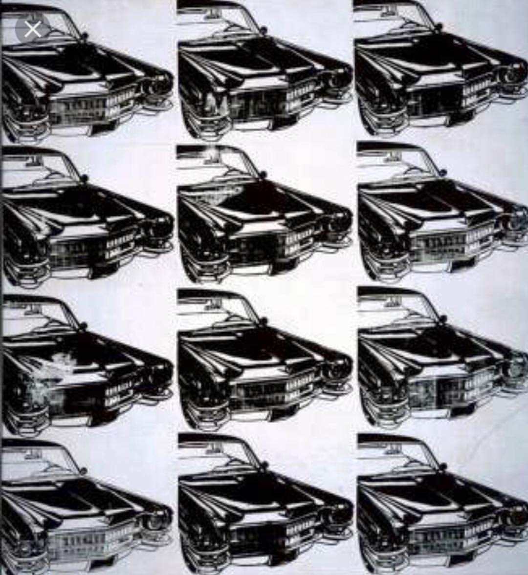
“Twelve Cadillacs” is a silkscreen on canvas that resulted from a “Harper’s Bazaar” commission in 1962. A large 46 by 42 inch canvas shows the front sections of 12 Cadillacs on a light-gray canvas. The images are supposed to be identical. They are not because either the screen and grid were not laid down precisely or through a variance in the amount of ink that came through upon pressing. For example, the image of the third car within the first column appears smudged.
An explanation of the silkscreen process can be found in a chapter to a Dia Art Foundation 1989 book “The Work of Warhol.” In it, Professor of Art History at Munich’s Ludwig Maximilan University Rainer Crone wrote:
“The silkscreen is a kind of stencil. A woven material is tensioned onto a wooden frame, coated with a photosensitive emulsion and exposed next to a photographic slide. On being developed with hot water, the emulsion dissolves, leaving the fabric in the unexposed area in its original state, while the exposed areas have been imprinted with the photographic image. The screen can then be used to print on any surface, such as paper or canvas, by pressing ink or paint onto the screen with a scalpel exactly the same size as the frame.”
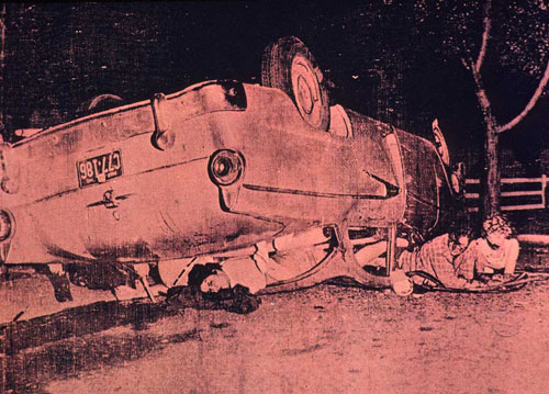
“Red Car Crash” (1963) is an acrylic and silkscreen ink on linen work that was just one part of Warhol’s 1962-63 “Death and Disaster Series.” The painting is based on a United Press International photo of a car accident. This work covers themes of life and death, morbid curiosity and the assumption of risk.
Cardinal red compels the viewer’s eye to this canvas. Except for one foot, the bodies of two dead sailors are unseen. Three of the accident victims (left to right): Lynda Kinor, Bobby Herd and Peggy Allen can be seen. Despite the gruesome appearance of blood flowing from their wounds, all three were freed from the scene and survived. Photographer Gerard Malanga, who was Warhol’s assistant at the time, describes this work in the book “Five Deaths:”
“Their faces...concealed by the dot pattern--concealed in the screen itself, acting almost as a camouflage to the aftershock that ensued. The faces now nameless... Mangled wreckage. A midsummer night on a lonely road to nowhere. The characteristic traits of what we’ve called modernity.”
In a telephone interview, Montclair Museum’s Chief Curator Gail Stavitsky provided background on the exhibit:
Eugene Chan: Why Warhol and why bring it to Montclair at this time?
Gail Stavitsky: “It was an idea I had in mind for almost 13 years ever since we acquired the “Twelve Cadillacs” canvas. We were contacted by The Andy Warhol Museum and they went through their show packages. “Twelve Cadillacs” was already in our minds, and upon seeing a car-related package we at Montclair knew an exhibition was on our hands.”
EC: Are their missing items from your exhibition wish list?
GS: For the most part no, but still in any exhibit there’s always something. In this case it was Warhol’s 1986-87 Mercedes-Benz series on the event of that company’s 100th anniversary. That would’ve perfectly completed this exhibition, but we couldn’t get anything loaned from Europe.
EC: Place Warhol in context with his contemporaries during the early 1960s period.
GS: At the time Warhol was gradually developing his style and wasn’t particularly focused on cars as a subject. James Rosenquist was doing his car-inspired billboards. Warhol did some work on Superman and Popeye. Roy Lichtenstein was establishing himself with his distinctive brand of pop-ism through the cartoons.
Warhol never said so expressly, but my theory is that Warhol’s move to the mechanical process and use of repetition was intended to distinguish himself from the pack.
As mentioned, the exhibit runs through June 19. Check it out for a fascinating look at a lesser-known facet of an American icon.